Does Your Brand Look too Corporate, or Dated? See How These Brands Leveled Up Their Design. We live in a time when brands are more visible and visual than ever. Here, six founders explain how they created brand design that stands out.
This story appears in the March 2024 issue of BIZ Experiences. Subscribe »
With people spending so much time on social media and the internet, consumers see more brands than ever, which means they also have a more finely tuned awareness of aesthetics and brand idententies. In a 2023 survey, market research firm Hanover found that 75% percent of companies have overhauled their visual identities since 2020, and Lucidpress found that 45% of customers "expect great design across marketing and sales collateral." In other words, an outdated aesethetic costs you money. At the same time, no company can afford to revamp their design every few years, so it's important to find a look that stands out, and stands the test of time. Here, we talked to six brands on how they found a look that sparkles while conveying their core values.
1. Design that beats the competition
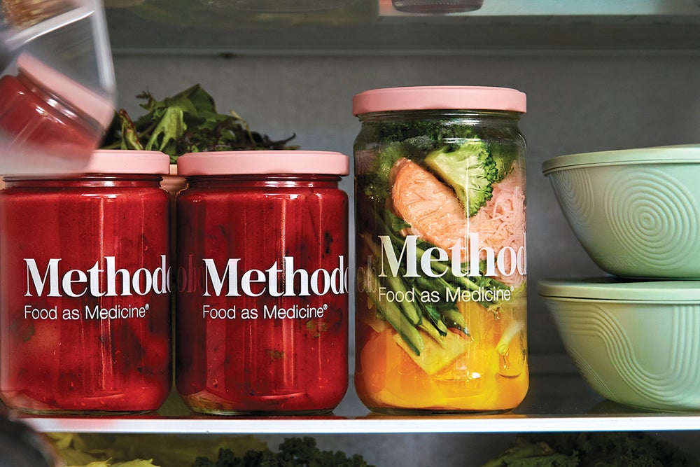
"The food delivery space is extremely crowded, and our competitors have raised over $20 million each, while we've never raised a Series A. So we couldn't rely on huge media budgets or celebrity endorsements. Instead, we focused on the aesthetics of our experience, so that photos or videos of our food would grab people's attention on their Instagram feeds. Our meals are packaged in reusable glass jars with millennial-pink lids, and reusable oval, pastel bento bowls that look like Easter eggs." — Julie Nguyen, cofounder and CEO, Methodology
2. Design that reflects your customers
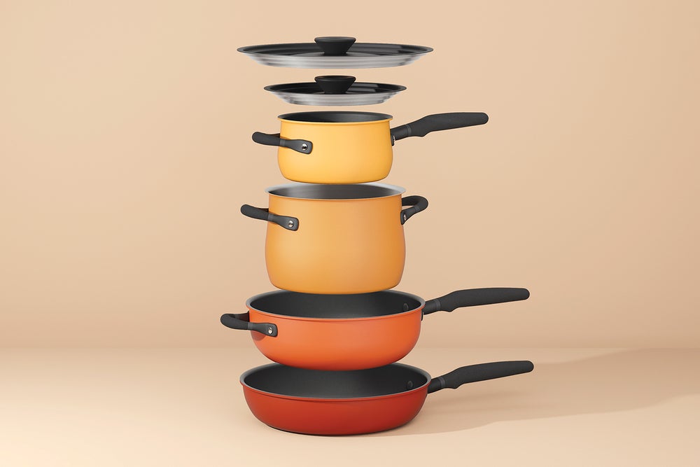
"Because we intended for our pots and pans to be sold globally, we wanted to use shapes that felt familiar — yet new — in the East as well as the West. So we took our favorite elements of Japanese design and mashed it up with mid-century Scandinavian design, and added a contemporary perspective on colors and finishes. We wound up with a product that was a little retro, a little futuristic, a little minimalist, and a little maximalist. And when pitching the products to retailers, I've realized they really want to know the stories behind the design." — MJ Truong, head of brand, Meyer Cookware
Related: Understanding the Power of Design and Branding
3. Design that amplifies your purpose
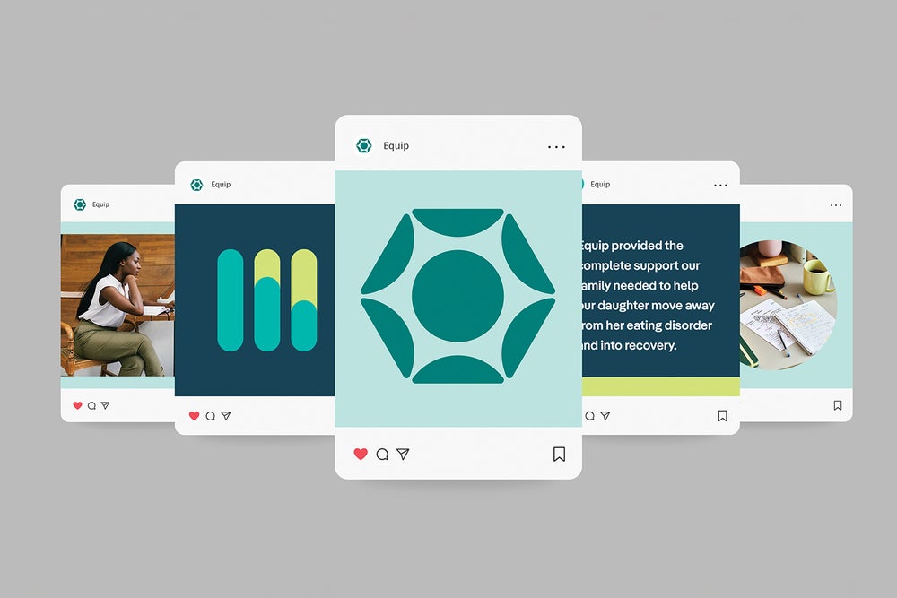
"In 2023, we did a brand refresh to capture the wide range of emotions inherent to eating-disorder recovery. Our curving line represents the nonlinear recovery journey that is universal to treatment, and our new color palette is brightened and more modern. We added a pop of peach for warmth and compassion, modernized our navy to a more youthful periwinkle, and added colors like lime and bright teal for a jolt of energy. Our website also now showcases a wide range of photography to honor the unique identities of those who struggle with eating disorders." — Lauren Gerber, head of brand and communications, Equip
4. Design that mirrors the product
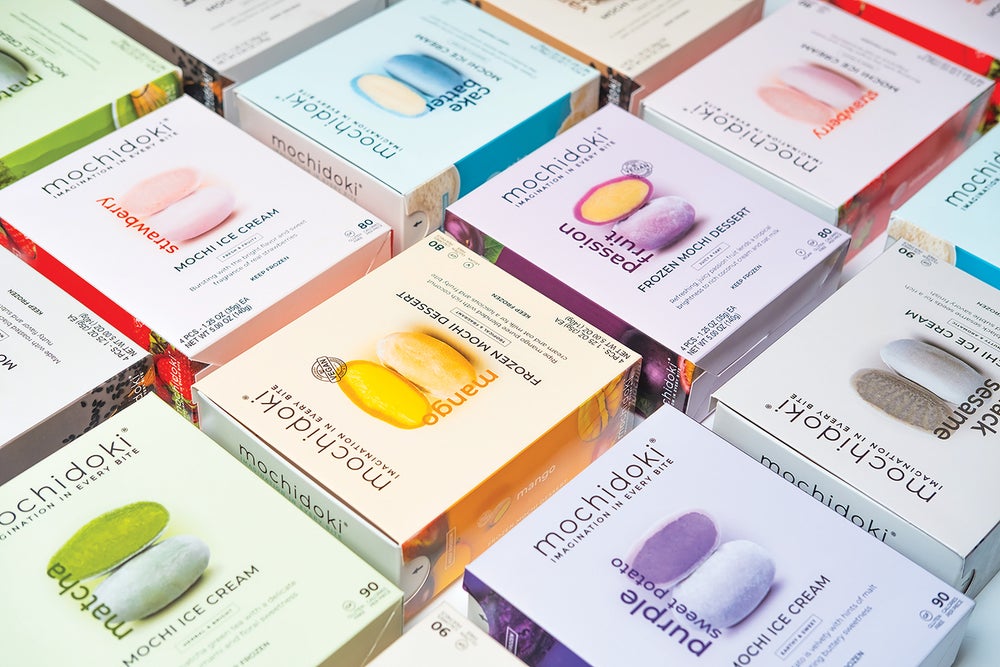
"When a customer takes a box of our mochi out of the freezer, we want them to know they're getting a premium product. Early on, we leaned heavily into sophisticated aesthetics, but found that our product was suited for a gentler nod to luxury. That means rainbow color palettes that are elegant but still fun, inspired by our flavors and ingredients. This is contrasted by navy and sandstone on the exterior packaging. It all emulates our mochi: simple on the outside, but a world of imagination inside." — Christopher Wong, cofounder, Mochidoki
Related: Branding Is Indispensable. Are You Using It to Your Advantage?
5. Design that scales with you
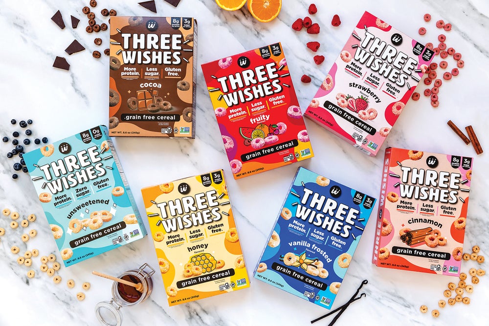
"With cereal, we knew we were entering the most colorful aisle in the supermarket. We joined the color explosion, but in a monochromatic, simpler way, to read healthier. We also wanted to visualize each flavor, but real food photography looked too corporate. Our big unlock was what we call 'delicious illustrations.' However, as we grew outside the natural grocery channel, and researched consumer insights from mainstream grocers, we gave our boxes a facelift with brighter hues, more prominent messaging, and more of a focus on flavor." — Ian Wishingrad, cofounder and CMO, Three Wishes
6. Design that welcomes people in
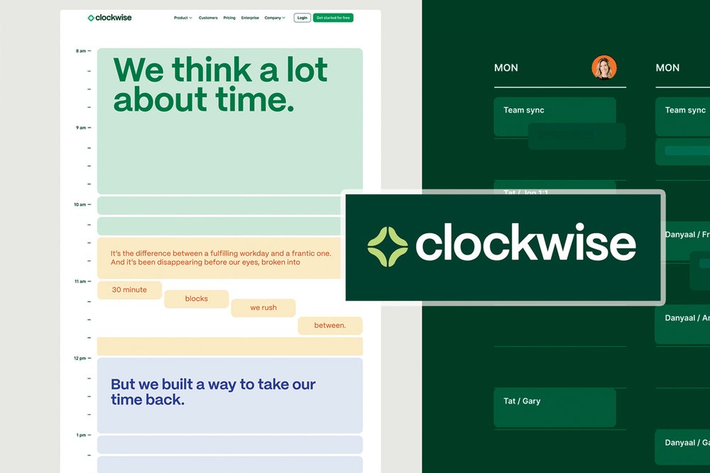
"Our first logo was a clock, with hands in the shape of a checkmark to symbolize productivity. But a few years in, we realized our branding was a barrier. The color palette was difficult to work with from a UI and UX perspective, our illustrative style felt dated, and our font choice — which initially felt unique — had become a marketing constraint. So we rebranded. Our new logo has a repetitive circular shape that represents synchronicity. It also looks a bit like the sparkle emoji, which is fun and current. And our primary color of forest green represents focus and reliability." — Matt Martin, cofounder and CEO, Clockwise
Related: Creating a Brand: How To Build a Brand From Scratch


